Did you know that the decoration of a space affects our mood?
In this post we will explain how the colours of the chromatic range influence us, stimulating certain emotions and altering or relaxing our mood. Later, we will take this concept to meditate on strategies in the decoration of your office, depending on what you want to convey through the colours you decide to choose.
It is true that I know that I feel more or less comfortable in certain places, but because I was based on the certainty that this depends exclusively on the personal tastes of each one. Well, no. It turns out that in addition to our tastes and the culture in which we live, the decoration (and everything associated with it, such as colors, furniture, the arrangement of elements, etc.) causes neuronal interconnections in our brain that make us experience different feelings and sensations without us being able to do anything to avoid it (sometimes I really am fascinated by our brain... it dominates everything and we don't even notice).
Feel nature inside the office.
One day, I remember we decided to transplant all our plants and flowers into new pots. So as not to disturb anyone, we kept the plants inside our warehouse and later gave them their new home. At that moment, one of our most loyal customers came to the reception. We met every day, since his company has hired a fixed office with us. However, we hadn't seen each other for a while, as they had recently moved from our second floor office to another of ours Offices located on the seventh floor of the building at number 30 Paseo de las Delicias. . . Well, back to what I was saying. We started chatting in the reception area on the second floor about how he was feeling in his new office, if he was comfortable, if he missed the daily hustle and bustle we experienced on the second floor with so many meetings, etc. When he was leaving, he stopped on the landing and looked at us with a confused expression. And he said… “Have you done anything new at the reception? It feels much colder to me…” We looked at each other thinking… Not that we know of. But then we realized… All the plants were missing. And that’s where we discovered the power of tone. Verde in our perception and sensations. Without any intention, the different tones seegivesceos Our plants and flowers conveyed a lot of peace and brought our visitors closer to nature, making them feel pure and free. A small touch, so small that you don't expect it to have any impact, and yet it exerts enormous power in creating a welcoming environment and enhancing our most creative and productive side.
Another day, while I was looking through a decoration magazine that arrived at my house the other day (I have to start organizing and redecorating my new rental house so that it stops looking like it's from the beginning of the 20th century...), I was looking for inspiration to create a cozy atmosphere that would transmit relaxation and calm in my living room. I came across an article that explained that These sensations are closely linked to the chromatic range that you choose for the painting of the walls and the furniture that you choose.
In fact, I'm also going to leave you a video, created by the psychologist Raphael Garcia, which explains very well what kind of emotions each of the colors stimulates:
And what is the ideal color to decorate a bussiness center, with all its offices y meeting rooms?
The idea seemed super difficult to me but at the same time something to meditate on.
In my opinion, an office should encourage concentration, fostering calm but also that nervous impulse that pumps and moves business. How do we manage to achieve this contradiction? Difficult. On the other hand, I think it is extremely important that the decoration of our centers is in accordance with the colors of our logo, right? We are not going to design our logo with pastel tones and fine calligraphy and then paint the walls of our office blue and yellow. It would make no sense and would completely lose the connection with the message we want to convey.
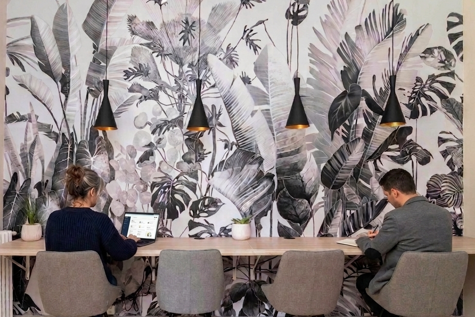
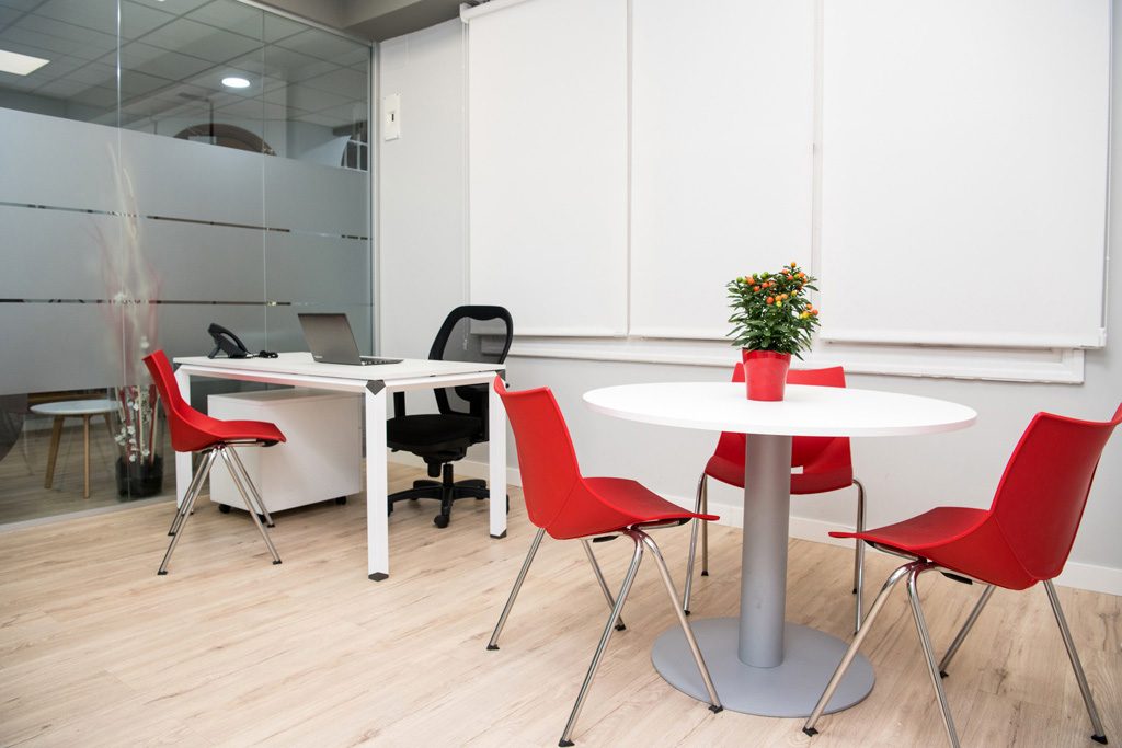
Sitting in the reception area, I looked at all the aesthetic features of our workspace, trying to analyse what they conveyed to me. Inspira Workspaces It revolves around four main colors: red, gray, white and black.
What sensations does each of these tones try to stimulate in our brains? Let me tell you:
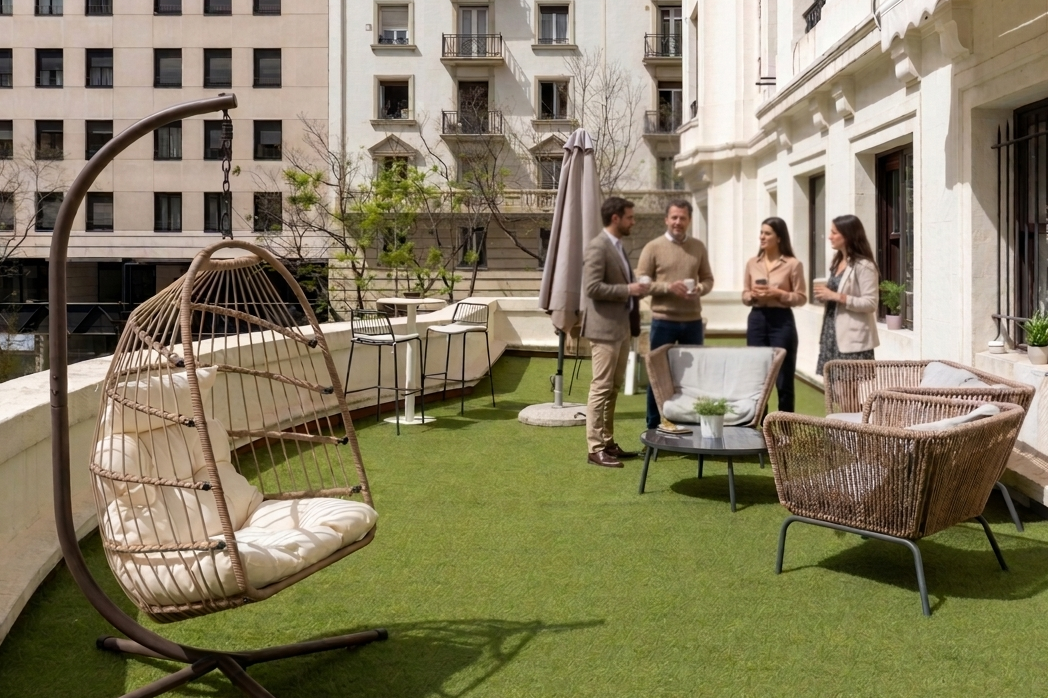
- Red: The official tone of passion, power, impulses, action-reaction, and the most powerful intensity. What does this color seek? Stimulation and the contribution of strength and energy in our clients, which leads them to close huge deals with maximum success. It is true that we should not abuse such striking colors as this one, because they can be overwhelming and achieve the opposite result to what we are looking for. In our center, for example, we apply this color to the chairs, armchairs and doors of each of our rooms and offices. Let's say that they are like small touches of color that bring vitality and energy to the environment.
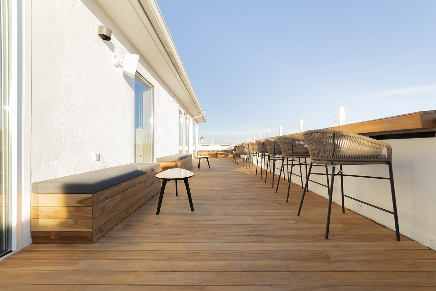
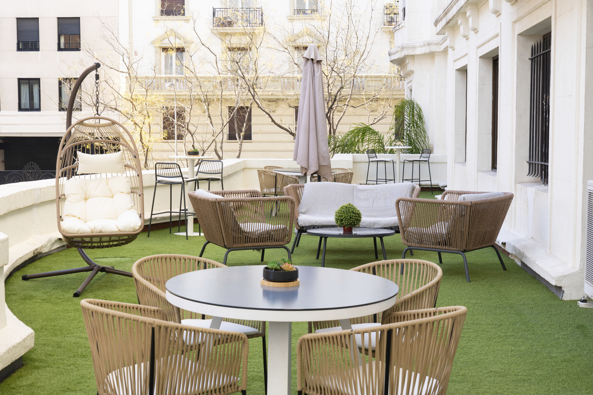
- Grey y Blanco: They are the neutral colours par excellence. They transmit purity, delicacy, sensitivity, seeking to make us feel calm and relaxed, very important aspects to keep our most rational side in check (a cool head is not a bad thing when dealing with transcendental issues for your company, don't you think?). At Inspira Atocha, the walls of the rooms are dyed a light grey that also manages to transmit the perception of spaciousness in the room, avoiding the feeling of being overwhelmed and confined. Each of our meeting tables is pure white, which transmits order and serenity, essential aspects to maintain calm within us, stimulating our concentration and preparing our brain to function in a clean and efficient way.
- Black: elegance, nothing more, nothing less. I'm not talking about painting the walls of the rooms black and making it look like we're entering a gothic mansion with ornate portrait paintings and chandeliers covered in cobwebs. Obviously, black will help us create beauty and elegance as long as we use it in small details, such as, for example, in the frame of a simple painting.
In conclusion, colours have a huge power over how we perceive the world, which I, of course, was unaware of. Although later on thinking about it, I said to myself… – Do you dress the same on a day when you wake up radiant and happy because you've met up with your friends to enjoy the Saturday midday sun on a terrace, and on a day when you've slept terribly because you argued with your friend yesterday, you have eight thousand things to do and on top of that you've just discovered that there's no coffee made? No, of course not. For the first option, I would probably choose a red skirt with white polka dots that I adore, with a white blouse and black heels, and for the second option I think I would go for a blue sweatshirt, dark skinny jeans, and my black Skechers sneakers (their soft insoles always accompany me on my toughest days).
So, if you are thinking of giving your home a facelift or radically changing the aesthetics of your business, remember to always define the message you want to convey in order to choose the ideal colours that will be faithful to the sensations you want to stimulate.